Grace Experience Product & Marketing UX Design

Marketing without design is lifeless,

Design without marketing is mute.

Web Design

Sandata

The healthcare industry is not always terrifying or boring! It can engage with storytelling.

Project Brief

Sandata is a leader in homecare solutions with a solid regional identity in New York and a national identity that’s in a positive period of growth. Sandata is set on a path guided by the “five rights of care”: The right member gets the right care by the right caregiver at the right location at the right time. Therefore, Sandata asked us to work on a mobile-first website for its new target audience and business strategy.

Project Analysis

While the incorporation of a brand personality into a website might seem far-fetched, it’s about relating to the customer. And relating is a critical ingredient in developing long-term relationships and creating brand advocates. However, the existing Sandata website failed to meet those expectations because of an unclear CTA and inadequate understanding of the user process.

After participating in multiple meetings to aid our discovery process, I concluded that it’s not unusual in some crowded categories (e.g., homecare) to find competitive brands with similar factual specifications and software products — so it might be Sandata’s personality that establishes a sustainable point of differentiation coupled with its values and focus on the five rights of care. After an interview with company’s key stakeholders, we found that the its core brand keywords are “trust,” “thought leadership,” and “innovation.” 

Sandata’s website targeted the following main audiences: prospects (payers and providers), customers (IT customers and business users), and partners.

Ideation

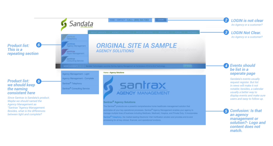
After sharing some of my analysis with client (image below), we we arrived at a new design:

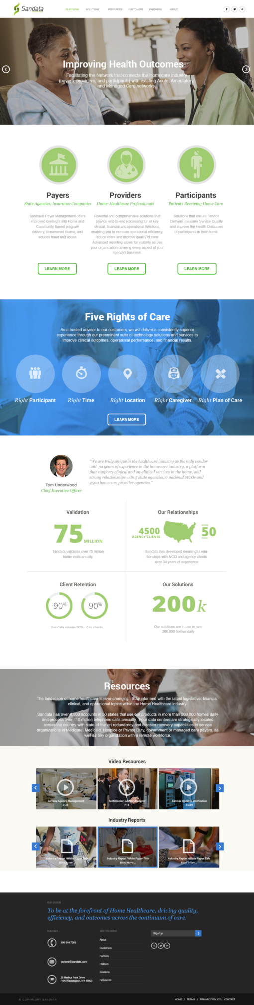
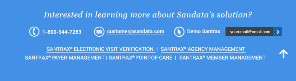
• Uncomplicated: The white space and a clean aesthetic create a simple, unfussy layout for users to most efficiently learn about Sandata’s solutions and contact the company to learn more.

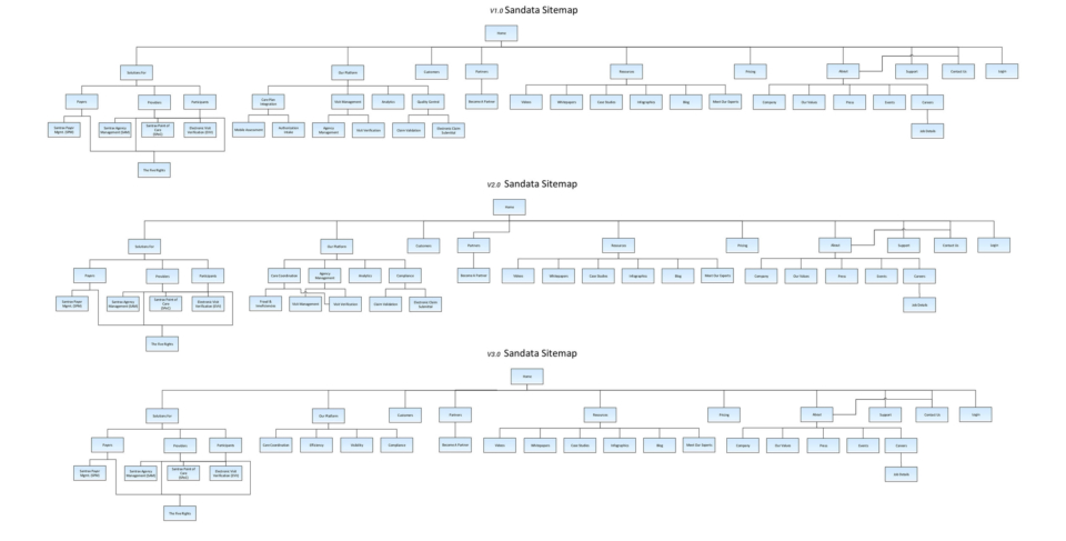
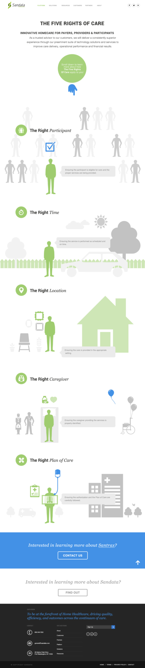
• Streamlined: Infographics highlight the key steps involved in the homecare process, and a clear logical funnel takes the customer through the steps of identifying the need, learning about Sandata’s solutions, and contacting the company.

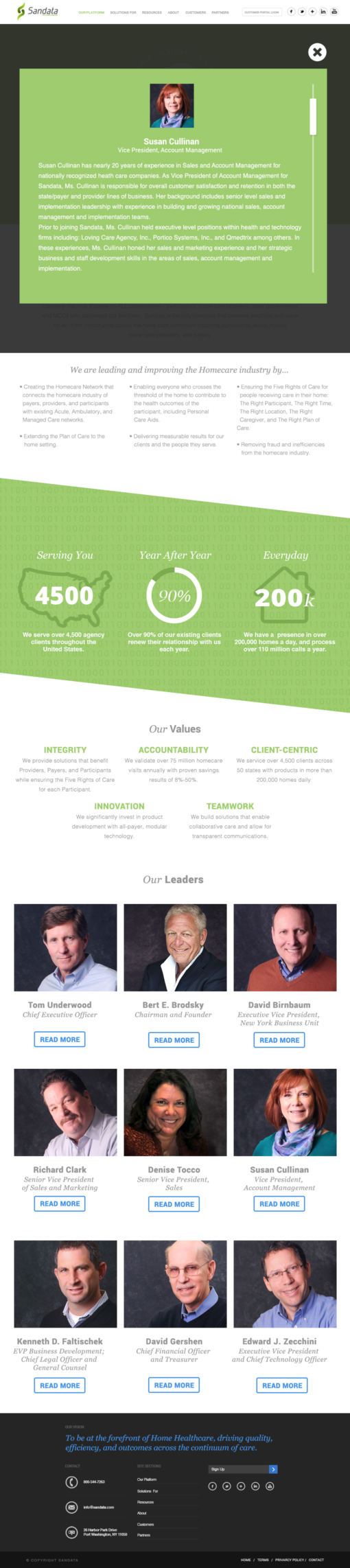
• High-quality: The visuals incorporate the correlation between “experience” and “quality” throughout the site design and messaging globally. We also incorporated key statistics that speak to experience with home health, case studies, and testimonials from providers, payers, and participants.

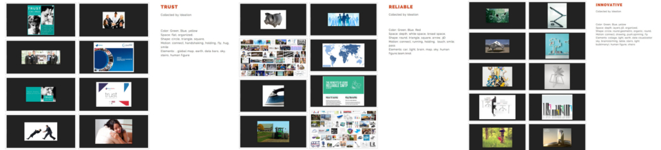
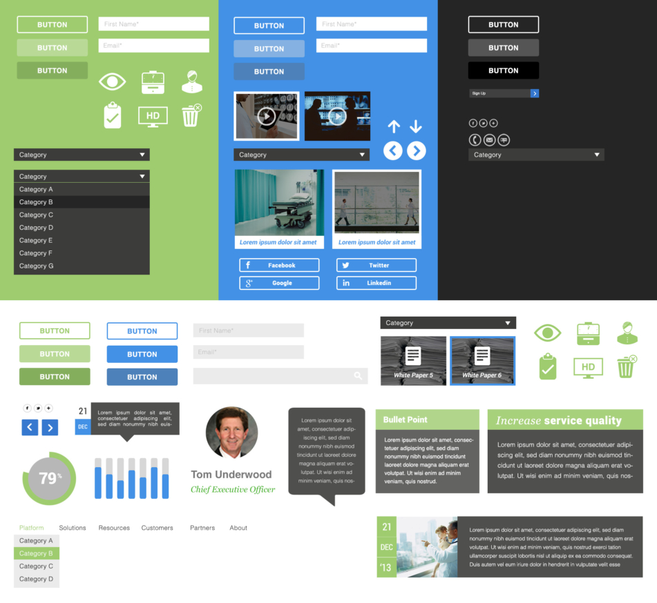
To accomplish this, Creative director Dan Luo and I found inspirational images and created the mood board.

Sitemap

In the three sitemaps versions, we tried to convince our client that all important content should be brought to the surface with a logical navigation. The sub pages should be no more than three levels down and guide traffic to pages — like those “five rights of care,” which articulate the core value of Sandata’s platform.

Home Page Design

A first impression is important. I used the landing page to reveal Sandata’s value proposition by explaining who we are and what we do with the support of rich data and an in-depth case study.

About Page Design

The “about us” page aimed to inform site visitors about the uphold idea and the company’s study method. We also advised Sandata to hire an in-house photographer to take headshots to keep the brand appearance high in quality and professional.

Five-Rights Page Design

The “five rights” page didn’t stem from a mission statement. Instead, we use storytelling to explain the care system. It gave the users a context to understand the value. Evocative imagery created an emotional connection and helped keep users calm when handling healthcare. We supplemented this by presenting the “five rights” process, so they could recall it in a personal way.

UI Kit Design

I like UI kit not only because it helps developer with css styling; completely change the look more effectively; standardized interface visually, it also benefits users to scan and understand the content better and interact with website easier.

UI kit improved my workflow and built the concept of designing based on component. I created this UI kit right after I've done the key pages so that it wouldn't restrict creativity.

User Testing Iterations

In my prototype testing, explored various iterations for better use of footer space. I wanted participants to remember they could access company information and product links there later on instead of forcing the user to scroll all the way back to the top. 

I retouched the “call to action” section on product page and solution pages, and varied this section’s copy page by page to resonate better with site visitors.

BEFORE: Call To Action across the site

ATER: Call To Action on agency management page

What I've Learned

This was my first B2B corporate site project, and it is very different from a consumer-facing site. The brand experience had many levels and several contributing factors. 

Let me give you an example. Say your laundry detergent got your clothes clean. You might say you had a good experience. But if it only came in 50-pound boxes, lugging it from the store to your home would have a negative effect. There are hundreds of examples of good products that produce bad experiences. B2B is no exception. 

My goal was to create a custom web environment to tell Sandata’s story by dividing chunks of it across multiple content buckets and landing pages to form one cohesive narrative. I wanted it to be a place that encourages audience engagement and connects Sandata prospects, consumers, and partners.

Drop Me a Line

Your Name
What's up?

Email Sent!

Thank you.
Soon we'll be in touch.

Oops...
A problem occurred while sending your message.

Passcode Required