Grace Experience Product & Marketing UX Design

Tell it like it is,

In a way they want to hear it.

Mobile Application Design

The Falcon
Navigation App

With Falcon, you can navigate to any point on a map, not just street addresses. You can save, share your favorite places, and access any location other people created and shared.

Project Brief

Falcon helps guide users to nearby spots such as buildings, stages (at a music festival, for example), fair rides, and more. Users can mark their location (e.g., a parking lot or even their parking spot) and send it to friends. Because sometimes your meeting spot isn’t an exact address! Falcon is an innovative navigation app with a specific user base, targeting people on college campuses, at outdoor events, and anywhere else they might lose friends in a crowd.

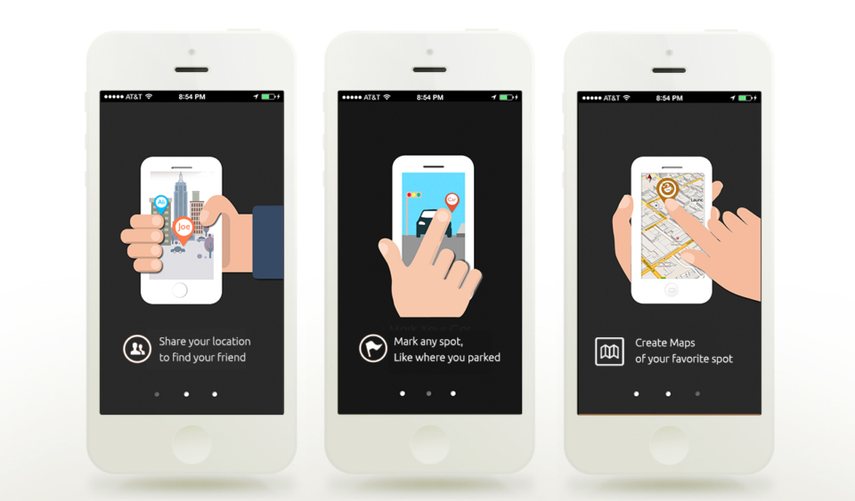
Our crowdsourcing system lets anybody instantly add a spot to Falcon so other users can find it. My role in this team was UX designer. I created the setting, navigation, and a slideshow tutorial for mobile devices. I was also in charge of the website and relevant marketing materials.
Project Analysis

Ideation

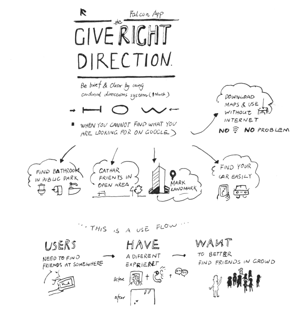
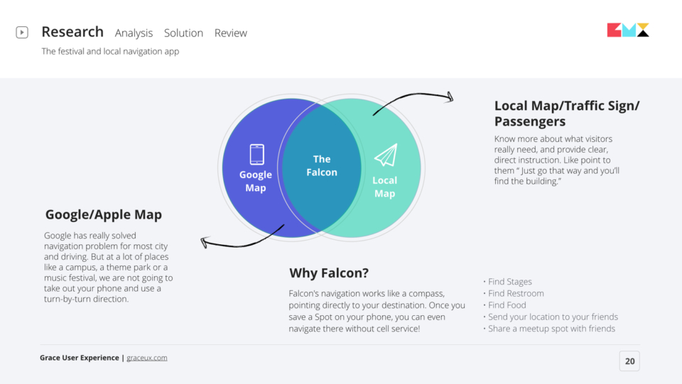
Falcon’s most important aspect is that it points to where you are going. Now we all have smartphones in our pockets, which have solved many navigation problems. But sometimes you don’t want to use turn-by-turn directions in public. They’re unnatural. We took real-life experiences and incorporated them into the app.

Use Flow

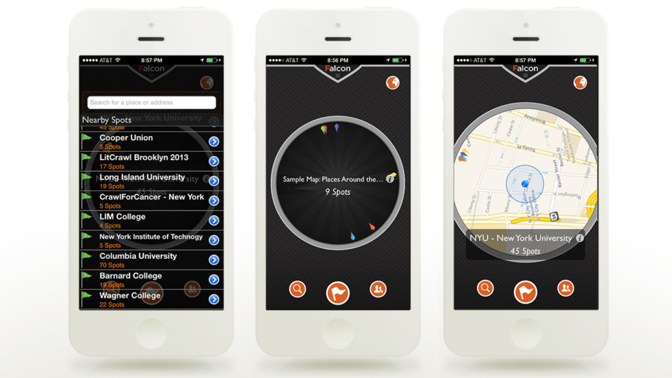
Interface Design

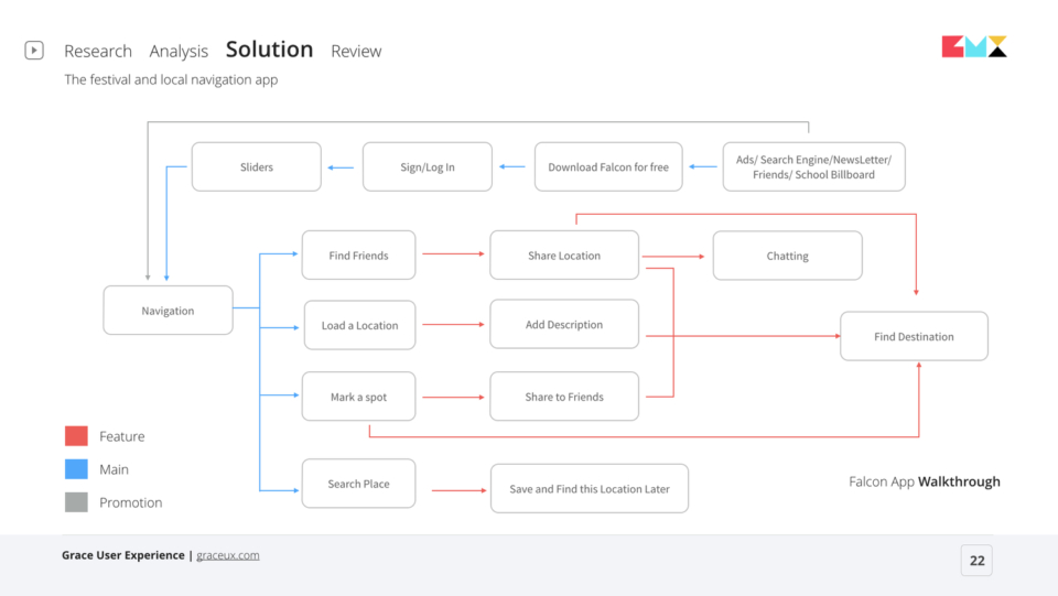
Friends can save their current location or designate a meeting spot that other users can see and navigate to using the full-screen compass. Users can choose to share their location publicly or send it to a single person. The app also collects local points of interests within a city. This ranges from pub crawls to art walks to the best picnic spots in Central Park. The app relies on users adding their personal places of interest. Accordingly, my team’s biggest challenge was building a large enough user base to generate these points and make the app worthwhile for travelers. We aimed to make an interface where all locations we marked related closely to the user’s interests and were fully accessible.

User Testing Iterations

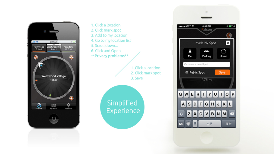
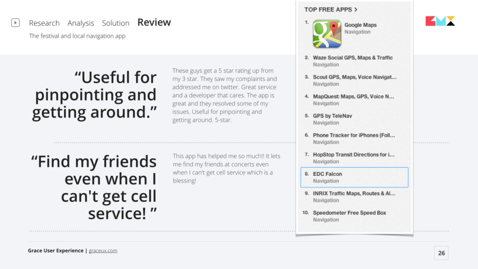
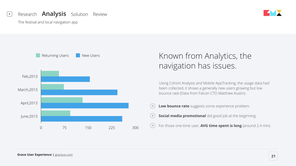
Through user interviews and App Store comments, we were made aware of problems with the privacy program as well as the long process of marking and saving spots. I’ve demonstrated the UX changes in this set of before and after videos.  

What I've Learned

Started in 2013, this was my first work with app UX. I learned a good app should self-explanatory with no learning curve and use familiar visual metaphors and familiar behaviors. I also tried to be a bit cheeky with the Falcon brand. One thing was color-coding your in-app friends with bird feathers. Users who downloaded the app loved this idea. I learned that providing small mobile interactions that surprise and delight users is important to any app’s success. They aren’t functionally essential, but they’re crucial to great user experience.

Drop Me a Line

Your Name
What's up?

Email Sent!

Thank you.
Soon we'll be in touch.

Oops...
A problem occurred while sending your message.

Passcode Required