Grace Experience Product & Marketing UX Design

Good design is obvious,

Great design is transparent.

Responsive Web Design

Aspire Event
Website

Aspire is an annual tech summit hosted by LivePerson for global clients. It brings together executives, e-commerce experts, service leaders, and more to discuss customer service tools and strategies.

Project Brief

In 2015, Aspire brought together digital engagement experts from all industries in a unique, small group setting to facilitate more relevant conversations, help attendees create valuable connections, and glean provocative insights to drive their business objectives forward. The annual conference is an interactive meeting that unveils the latest tech trends in communication and best practices for customer care professional. It also gives LivePerson an opportunity to demonstrate of the latest features of its product, LiveEngage.
Subject Research & Analysis

I led the website UX design for Aspire’s 2015 event site. I set a goal to reshape the brand’s online presence through creating a sleek user interface and shifting the site focus to nurture a community of customer care professionals that would offer a more engaging online experiences for customers. As an IA and UX person, I researched and created a series of ideations before planning and restructuring the site, followed by important considerations from both the design and development points of view. Here’s my work in progress for the ACCPI website.

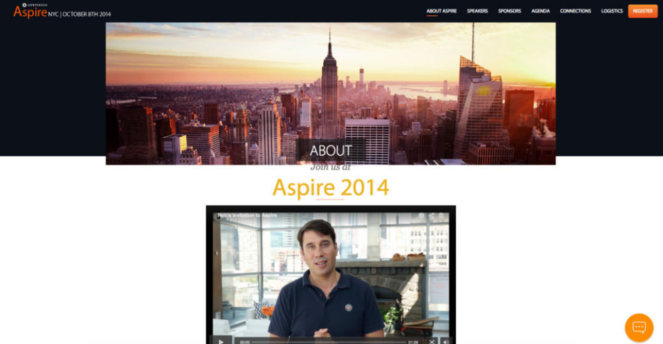
The first question will be: what do visitors want? Aspire’s previous site was repetitive and buzzword-heavy. As we tried to target a wide range of visitors, we failed to focus on their needs, interests, existing knowledge, and emotional levels. So I dug into the visitor research as well as the content strategy and provided only the relevant information.

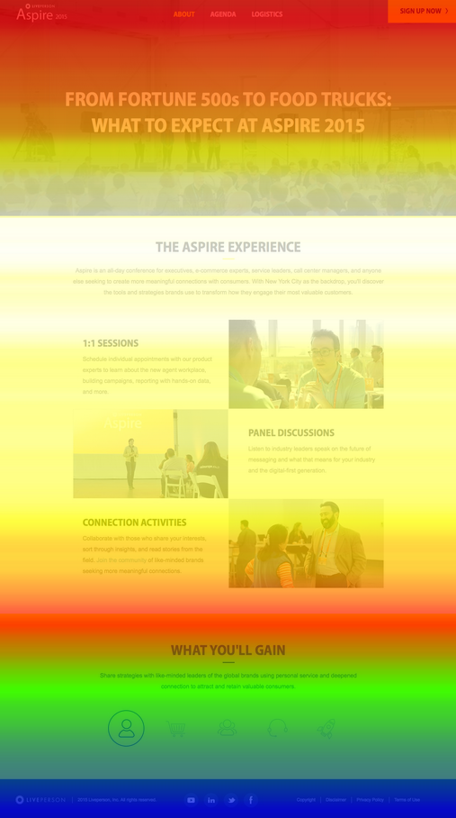
Secondly, the problem of the section above the fold.

The importance of this first impression is well-known, and a much larger space was utilized to tell the full story and relay all information. The area above the fold is often used to guide users further down the page to the places the designer wants them to see. Being able to grab a user’s attention yet keep them intrigued enough to remain on the site and seek out new information and content is an important skill.

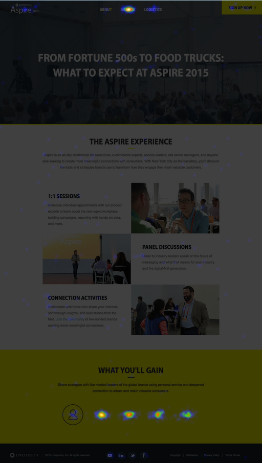
Thirdly, overcomplicated navigation needs to be reorganized.

For the sheer amount of information we wanted to present here, the navigation seemed complicated and confusing (both for visitors and SEO) from a content-strategy standpoint. We summarized the most important information and displayed tangential information on other pages.

Ideation

Since the target audience was our business partners and potential clients, it was more difficult to conduct user interviews or questionnaires online. Not to mention that I only had three days to finish the wireframe and UX plan! As a compromise, I reached out to the previous year’s stakeholders and contributors and asked them what they considered Aspire’s most exciting and fun part and what differentiates it as a digital event. Through Twitter, I also found a photo gallery to use as references. The results were outstanding. Attendees from last year recalled that the 1:1 sessions, panel discussions, connection activities to be the most interesting and helpful. The goals were:

  • Convey information in a more user-friendly way with better and simpler navigation.
  • Organize content and use the progressive disclosure concept to handle less important information.
  • Make a responsive website. From a user’s perspective, there’s nothing worse than hopping from a site that adapts to their mobile device to one that still adheres to old web standards. It makes the site seem outdated and stale overall.

From a user’s perspective, there’s nothing worse than hopping from a site that adapts to their mobile device to one that still adheres to old web standards. It makes the site seem outdated and stale overall.

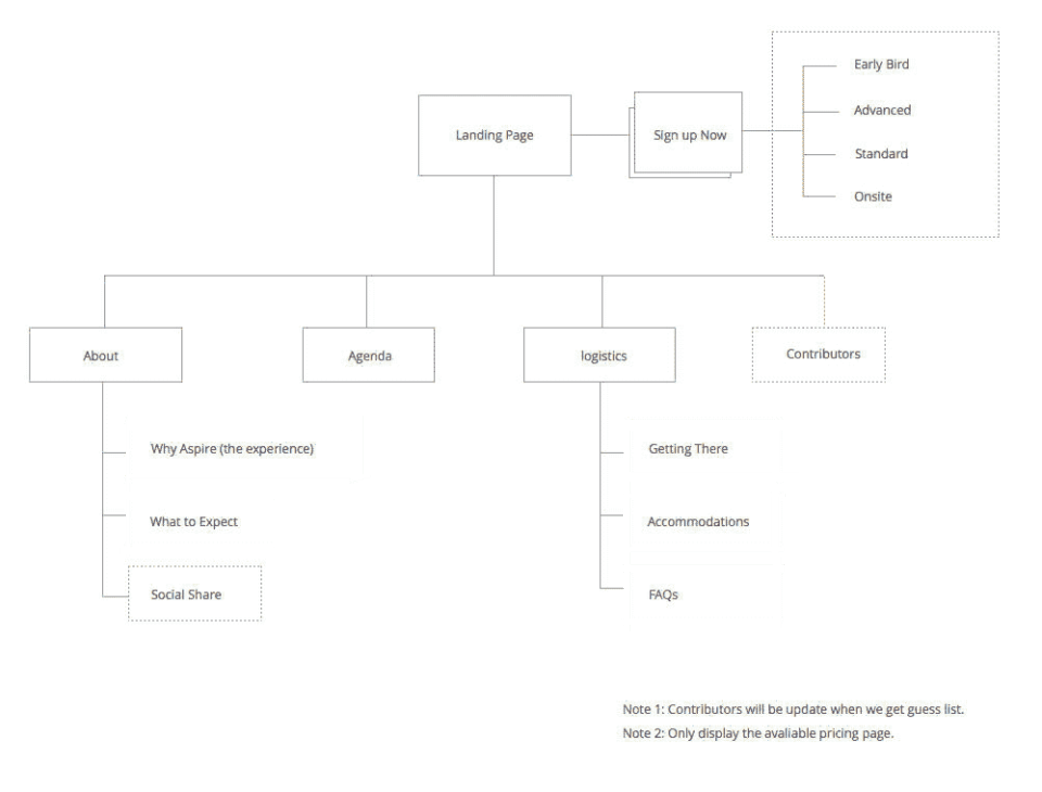
Sitemap

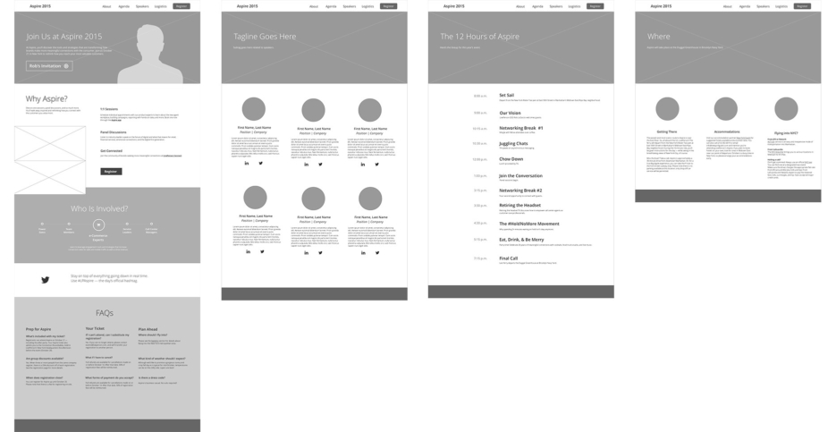
Wireframe

As  the wireframe shows, we didn’t want to simply dust off the remains of 2014’s site, and we looked at 2015 as the year we would take our event website to the next level. More importantly, many attendees and prospective sponsors would first hear about the company by visiting our event landing page. Making sure we had a standout site was critical to the success of an event professional and the success of the event itself.

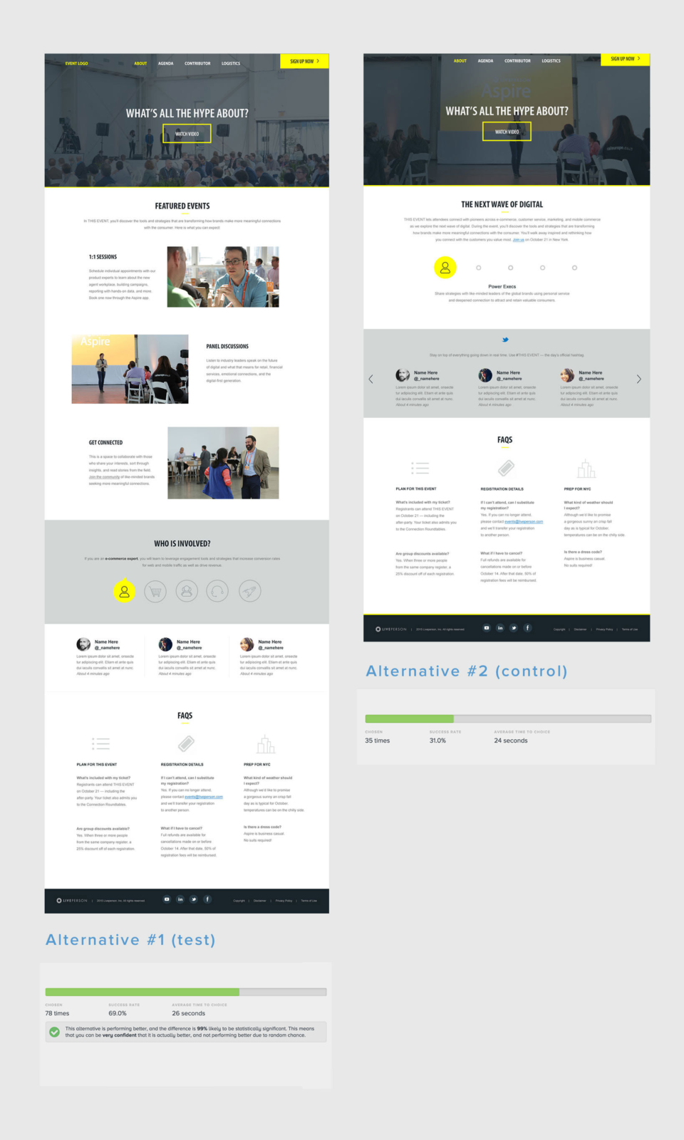
User Testing Iterations

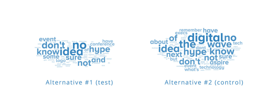
Although the test version was favored, when it came to the five-second test, they actually got less information in a shorter amount of time. As you can see in the following summary, almost 55% testers' replies were "don't know" or "I have no idea" verses 35% of the testers who replied along those lines in the control group. Why could this be?

After carefully comparison and analysis, I suggested content changes to our copywriter: Instead of using sleek or fluffy words, we should be more straightforward and hit the main points harder. By checking the live site, you can really see the differences.

Bonus Finding and Further Iterations

But what surprised me come with the following  5 sec test, although the test version is favored by testers, but  testers actually get less info about what it is in a short amount of time...as you can see in the following summary, almost 55% testers' reply is "don't know" or "I have no idea" verses 35% of tester reply the same in control group, so what can be the reason?

After carefully comparison and analysis,  I suggested content changes to our content producer: instead of using sleek or fluffy words, we come up with more straightforward and hit the main points harder. By checking the live site, you can really see the differences.

Post-Launch Analysis

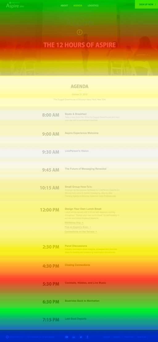
This event site performed well in many perspectives: Users clicked through all the key information and engaged with the interactive element, the scroll rate is much higher than the former website, and it also drove 13% more purchases than last year. (We also  advertised this event more on other channels.)

What I've Learned

Communicating with your internal team is very important so everyone involved is aligned with the goal. Learning from the hard data is effective, too. If you don’t know what didn’t work before, you won’t know what will work now.

Drop Me a Line

Your Name
What's up?

Email Sent!

Thank you.
Soon we'll be in touch.

Oops...
A problem occurred while sending your message.

Passcode Required