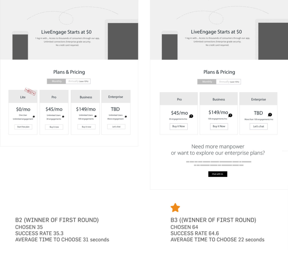
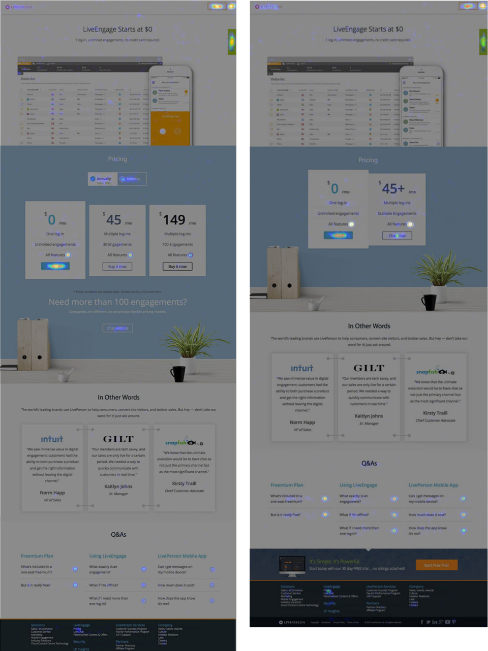
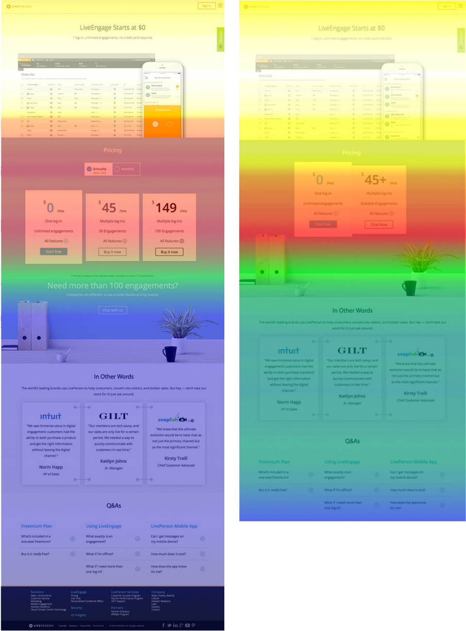
Grace Experience Product & Marketing UX Design

Verbalizing design is

Another act of design.

Web Design

LivePerson
Pricing Model
Design

The best pricing page is simple and uses clean lines with a teaser to draw customers in. As the saying goes, “Too many brush strokes spoil the painting.”

Project Brief

I led the website UX design for LivePerson. My goal was to reshape the brand’s online presence through creating a sleek user interface and transferring the site focus to B2C, which would offer more engaging online experiences to customers.

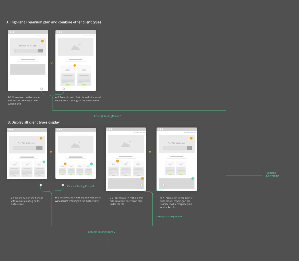
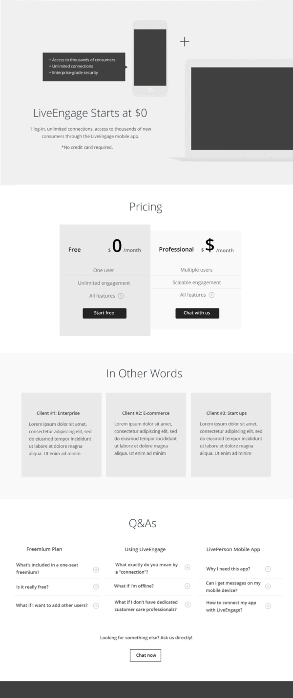
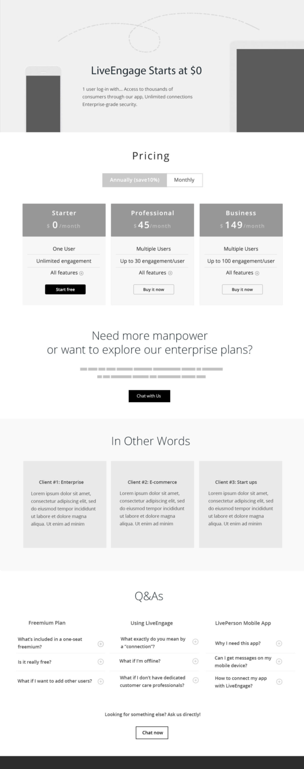
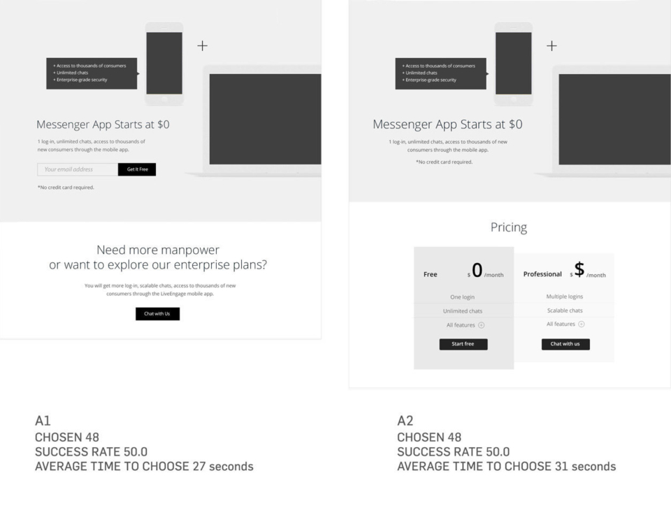
As an IA and UX person, I researched and developed a series of ideations before planning and restructuring the site, followed by some important considerations from both the design and development point of view.

Subject Research & Analysis

The interactive heat map reflected the same issues found in the video. Because the user already saw the engagement definition upfront (above the fold), user interactions decreased dramatically below. The user spent some time reading about engagement needs and using the calculator. It’s a good design in terms of helping them figuring out the right plan, but it also pushes the pricing table down, so it's not initially visible when a user lands on the page. The "Common Questions" section also needed improvement. Some visitors saw it; others didn't. It’s better to be upfront and easily found.

*The bounce rate was 42.8% — not bad for a pricing page!

Problems

Here’s the original pricing model and some tests I recorded. The takeaways are:

  • Visitors want to see pricing and features in the same table.
  • Visitors want to understand the differences between plans and goals.
  • Visitors do not understand LivePerson-specific buzzwords(for example: engagement.)
LivePerson Testing Video

Ideation

Our goal was to promote the “Freemium” plan, which included one user per account for $0. But the gap between self-service team and field market team presented the biggest conflict. Why buy the product when we’re giving it away? From self-service team’s perspective, enterprise clients never visit our website so we should emphasize Freemium. But the field market team felt the page should cater to our bigger clients, who bring in the money. Both teams agreed presenting the pricing range was difficult, since it highly depends on the scope of the account.

In the design of the page, we were left with some open-ended questions that were too complicated for A/B testing without a clear goal and evaluation metrics. I presented several wireframe iterations and a testing plan road map to the team to make sure everyone was on the same page. Layout set A reflects the self-service team versus set B, which is a summary of field market team. Saving the most crucial performance testing until after launch, we can now take a close look at the design and participant’s reaction on each design.

Wireframes

Based on the above data and user analysis, I decided the key point for the new pricing page should be: focus on pricing itself instead of explaining an unfamiliar concept for visitors. (Especially as we are using a new pricing model and drive traffic, there will be more first-time visitors.). That means with a distinguished strategy/UX within A and B sets, all the other part of the pricing model should:

  • Clearly present what we sell to visitors — a combination of a partially functional mobile app and a web dashboard — so users’ expectations are met.
  • "Why should I pay there's a free plan?" will be the #1 question visitors ask when they see our pricing page. 
  • Target visitors by supplying related testimonials and Q&As (also valuable for future analysis and improvement.)

These were the two wireframes had been delivered to visual design for A/B testing. Other testing wires haven't include in this presentation.

Wireframe A2
Wireframe B3

Concept Testing Result

By setting up a background as a business owner of an e-commerce website and going to buy a online chat product, I ask participants  “Which design do you prefer?” to my 100 testers*, so I could get a better feel overall about which would work. The results, and all the test layouts were tested on UsabilityHub.com’s Preference Test Users, with in 100 users per test.

*100 testers* are random users online. This is tested content and design.

In A-set testing, version A-1 vs. A- 2. draw, select A2 for A/B testing. 

Users preferred version A-2: 51% of the users chose A-2 while A had 49%. There was no winner version, but based on our experience, we slightly leaned to version A-2 because we were not sure about the email input solution.


In B-set testings, version B-3 wins, select B-3 for A/B testing

Users preferred version A-3, and one of the hypothesis is: 3 tiles of pricing seems to be a desirable amount of content for users to digest, it also possible the the uncertainty of “Pricing TBD” on the enterprise plan makes user skeptical- if we want to get some insights on this copy, we may test some different ideas later.

A/B Testing

A launch test compared A-2 to B-3 within different propositions (mainly focusing on performance differences — for example, the conversion rate). Plan A-2 had a higher CTR based on a 5,000-visitor sample. I then ran the next round of tests after seeing the final conversion-rate results. I also discussed with the team about the possibility of taking advantage of the fact that mobile is the fastest way to get users to download an app, so it’s better to focus on acquiring a mobile customer than a sale in the mobile purchase flow.

Another trick was to add plus (+) icons next to each common question. It helped us track visitors’ click rates so we could better understand what they were uncertain of or needed more content and context around to make decisions. As you can see, around 12% of users did click through the FAQs.

What I've Learned

LivePerson.com drives heavy traffic around the world. However, with its features and general info constantly evolving, the online branding tends to speak on its own and becomes less concerned about the customers' pain points and experiences. As a problem of first priority, that has to be optimized, because LivePerson strives to offer the user better quality in a real product.

It’s always tricky to conduct concept testing because it’s always worth noticing what should be tested for design and what should be conduct by a real A/B test to validate strategy. I explore this question in the Medium article here.

My other projects at LivePerson included core web pages (home page, product page), mobile app, affiliate marketing design strategies, and email campaigns. Details are available upon request.

Drop Me a Line

Your Name
What's up?

Email Sent!

Thank you.
Soon we'll be in touch.

Oops...
A problem occurred while sending your message.

Passcode Required