Grace Experience Product & Marketing UX Design

Verbalizing design is

Another act of design.

Interactive Experience

Real-Time
Fengshui

This project is designed to present abstract feng shui principles, its philosophy, and its applications in modern interior design through an interactive 3D experience..

Project Brief

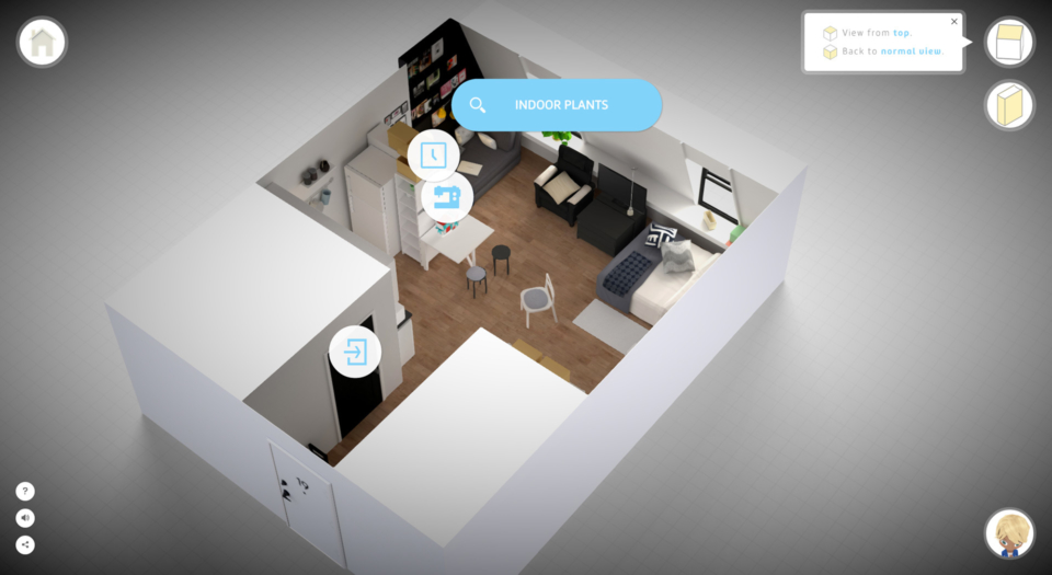
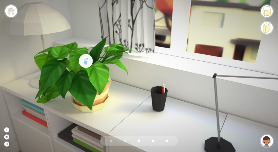
The Real-Time Experience is an interactive educational project that introduces daily feng shui tips to college students, office workers, and anyone else who wants to learn how feng shui can enhance their lives.

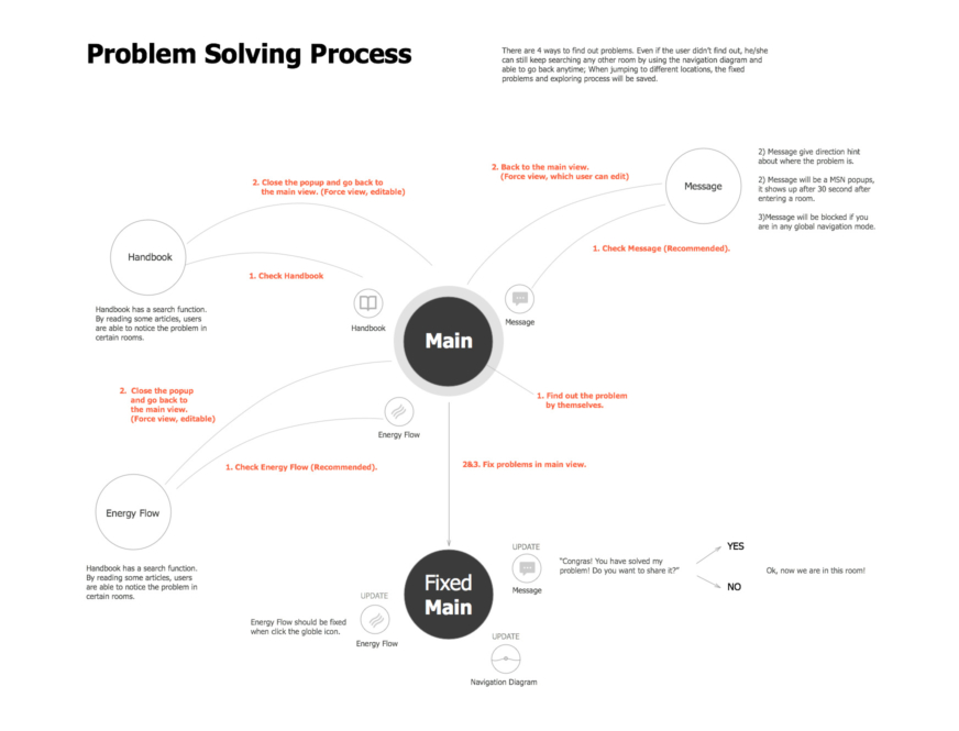
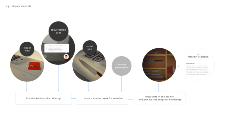
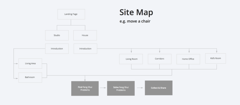
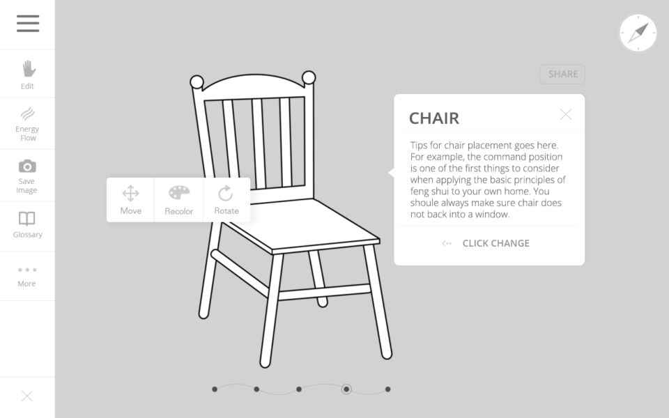
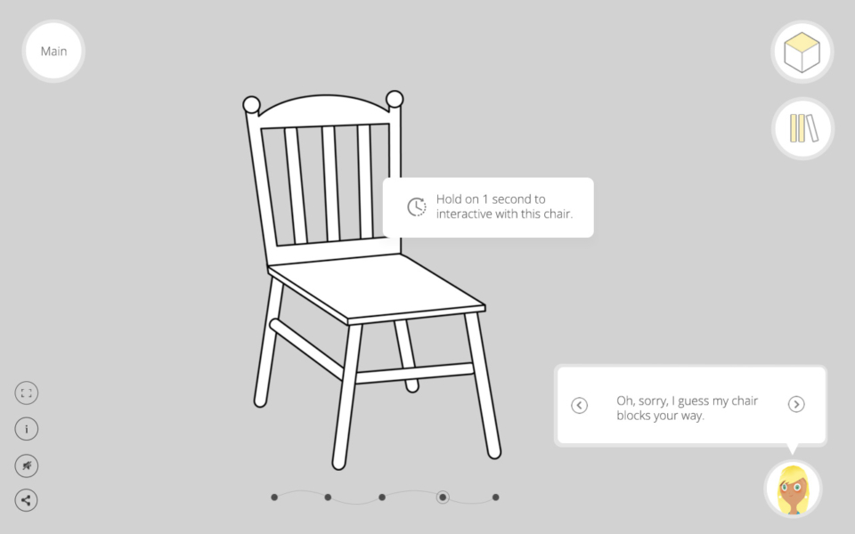
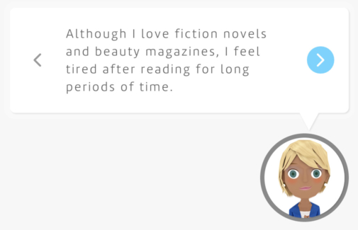
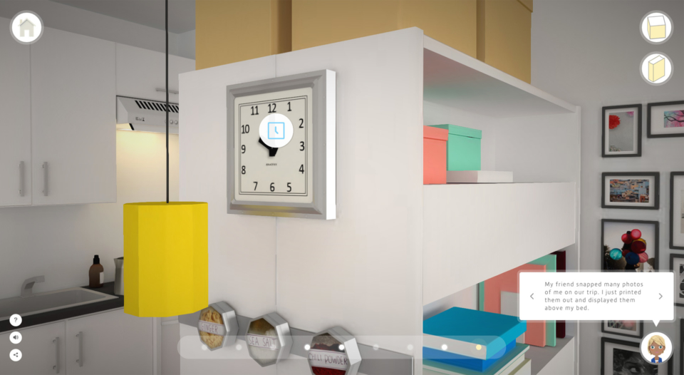
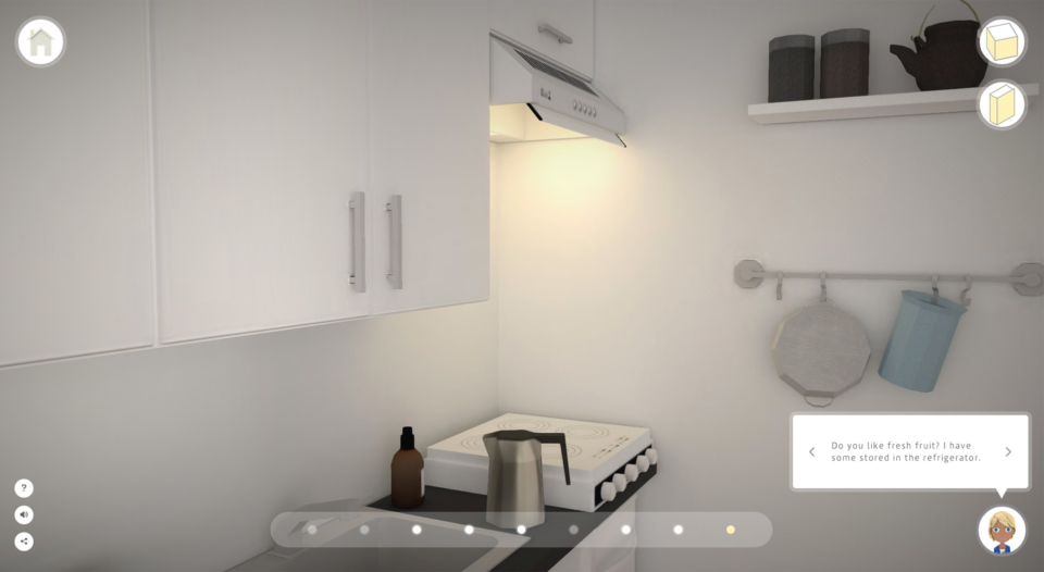
The user flow is a simple four-step process: Listen, observe, find, and solve. This is how feng shui masters help people discover their problems. It is an engaging practice, because users are actively involved in problem-solving. I hope that by introducing feng shui to a new western audience, they can improve their living environments.

This project has been listed as semi finalist for the Adobe Achievement Award 2015 (web and application categories) and published a book in early 2016. I also published a book which covers the the ux design and technologies has been used in this project. Here’s a link to purchase it.

Subject Research & Analysis

Feng shui, as a more obscure theory, makes most website design less interesting. During the product-research phase, I often encountered the following one big problems: With a page full of incomprehensible theories and overused symbols, feng shui feels almost like a pseudoscience.

Conversely, I'd like to introduce this theory through storytelling and teach its principles through real-time problem-solving as well as give the user down-to-earth tips.

I was also curious about the best learning curve and format. What is, ideally, the opening story for those site visitors without any background information about feng shui at all? What makes users excited about the feng shui — what benefits them most? I developed a questionnaire with nine questions and asked a 19-member target audience* to complete it. To my surprise, most respondents would prefer to jump into a practical and visualized case study that could be applied immediately to their day-to-day life. Here’s a summary of the research: 

  • 88.9% of respondents are looking for basic and simple feng shui advice
  • Their main interests in feng shui relate to how this concept can be used in real life
  • Users expect a visual, interactive learning process.

* The target audience is the generation aged between 18 – 35, including college students and young couples with an interest in improving their living environment. I also included those with an interest in online learning.

Ideation

Instead of thinking about how to convert new visitors to this topic, I'd like to explore how feng shui theory can actually interest and retain an audience. My next step was to discover the secrets of a feng shui master. After watching videos, researching in books, and even attending several seminars myself, I realized feng shui is subject that you really need to practice what you preaches, and by only reading textbook(even with well organized information and rich images) would not help.

Feng shui uses active verbs like “change,” “add,” and “replace.” These are direct and easy to follow, just like a call to action in web and poster design.

Here are a couple of quick sketch of my ideas:

Use Flow

In feng shui theory, a knife relates to sharp energy and should be placed inside a drawer to block the negative flow. (This also is just common sense — you must store all knives and other sharp objects safely.)

Take the “relocate the knife” example in the townhouse kitchen:

As a user explores the living room of this contemporary townhouse, he may be distracted by the back window (the view is so nice!) and subconsciously moves into kitchen area. Or if he’s paying enough attention to his hostess, Joanna, he’ll get the hint to pick up the knife and, naturally, try to find somewhere to store it. A visual hint would pop up on the tabletop and instruct him to place it inside the drawer. To finish the exercise, the last thing user will see is the feng shui theory, revealed behind the scene.

Sitemap

Wireframe & Interaction

The UI design simplifies the visual elements and user flow. I came up with two basic design layouts for the main page. 

The first layout has a dynamic side bar menu: When a user hovers over there, the sidebar pops up. When a user clicks on a special perspective, the right slide-in content panel with content appears. The second layout has simpler float menu gives users more space to explore and be able to provide linear functions in need — without the left sidebar occasionally stretching out and distracting them. The simplified rewards system encourages users to keep going to resolve all the feng shui problems. 

This set of UI designs also combined similar functions in one icon; for example, the navigation cube can help users look around (if the user clicks the sides) as well as observe the whole room in a top-down view (if the user clicks the area above).

Dynamic Side Bar Menu

Float Menu

Character Design

Game characters — or “feng shui clients” — are based on different backgrounds. For example, Ollie’s looks set her apart, because she works in fashion; on the other hand, homeowner Scott is a university professor in the Department of Mathematics. He looks contemplative and dresses conservatively.

Conversation Design

Introducing these characters makes the the 3D feng shui experience more engaging. They each have a welcome page when users enter rooms, a thank-you page when users finished all the tasks in the rooms, and, during exploration, the characters are on the bottom righthand corner of the screen and occasionally “ping” visitors with hints. Users can also click the characters and ask for clues directly.

Reward System Setting

The use flow is one of the many examples I’ve created in this interactive scene. Users should be able find items observing the characters. I use three kinds of psychological rewards models in Feng Shui Real-Time:

  • Variable tasks. The all-problem-solving experience includes different kinds of interactions greater than just relocating a knife. It also includes replacing, covering, adding, and decorating a specific item. Users are slightly challenged but truly enjoy the puzzle-solving process. The variable task also intrigues users’ curiosity and drives them to keep exploring.
  • The psychology of collecting a whole set. I carefully set up each room’s four to five tasks at different levels of difficulty. (At least one of the tasks is a giveaway.) By solving three more feng shui problems, users grow eager to fix all of them. Even in my user-testing process, when users couldn’t finish within the expected 60 minutes, some asked me to let them finish all the puzzles without giving away the answer directly.
  • Badges and awards. I liked the original idea of having badges for each level completed and letting users share theirs on social media (which also helps promote the app). However, due to the time limitations, I use a simple “thank you” note with a summary of their accomplishments to reinforce learning and results.

Interaction Design

In order to convey the relaxing feeling feng shui is meant to illicit, animation is smooth and slow but also instant. For example, when a user puts a goldfish into the tank or does anything else to create better feng shui, the red leaves, which indicate bad feng shui, turn green. This visual feedback is a quick reward to users so they know they’re doing the right thing.

User Testing Iterations

During the user-testing process, I found that most people start their tours as quickly as possible, skipping over the intro. Those who did read the instructions rarely remembered what they were supposed to learn. They haven't seen the interface yet, so they don't have any sense of where and how the tips will apply. This is where my just-in-time education concept applies. 

I've tried different methods to solve this problem. I tried overlaying the tutorials on top of the actual interface design. Even so, people lack the experience to know which actions will be useful to them and when. Besides, over time, they're likely to forget some of the functions since they didn't take action immediately upon learning. 

Instead of trying to teach everything up front and all at once, teach it the very moment specific information is useful. In my case, I provide only the necessary tips for each visitor. For instance, if a user started clicking around to explore the 3D scenes, I suggest he scroll the mouse wheel — and vice versa. Last but not least, the how-to instructions are always on the left corner of the page, making it easier for visitors to check them out anytime.The trick to getting just-in-time education right is revealing useful information when people actually need it — not when they don't.

Reading Instructions
Getting tasks from your client
Exploring the kitchen
View collected Feng Shui items from above
Discovering new Feng Shui items

What I've Learned

I took away many things in the analysis, UX design, and testing as well as gained experience with project management — how to optimize the process and prioritize tasks. This project made it computationally expensive to have the many models in one screen as individually backed objects. Instead, it was necessary to group and bake them into shared textures. Monitoring, comparing outcomes, and understanding the technical challenge to quickly figure out a work-around is extremely important and should be awarded at an early planning stage.

A bonus: The reward system works well and helps users build up a solid memory. One tester even told me she’s addicted to the game and learned more about feng shui in five minutes than she has in 30 years. A five-years-old boy even left his email address and asked me to send he the link when the site is live (which, of course, I did!).

Drop Me a Line

Your Name
What's up?

Email Sent!

Thank you.
Soon we'll be in touch.

Oops...
A problem occurred while sending your message.

Passcode Required