Grace Experience Product & Marketing UX Design

Never stand still,

Always moving.

Mobile Application Design

Period Pal

Period Pal is a tracking tool that helps young women manage their periods better, be aware of any health problems at an early stage, and develop a sense of how lifestyle factors affect menstruation.

Product Brief

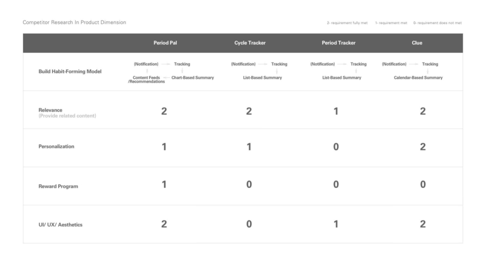
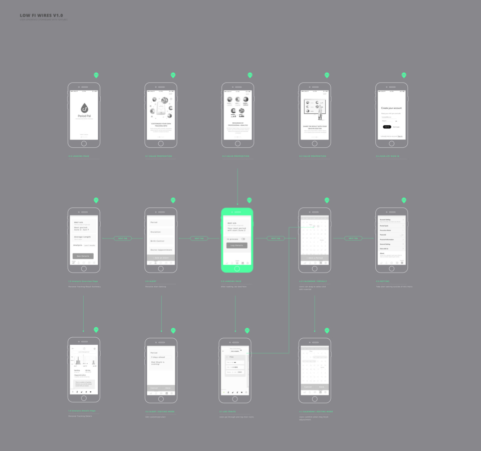
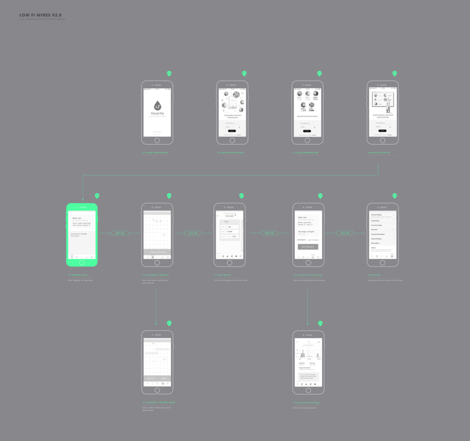
Period Pal has her four unique value propositions: actionable (provide right amount of feedbacks for user’s tracking info); rewardable (users can visualized the result), customizable tracking trait, and professional (content reviewed by gynecologists).

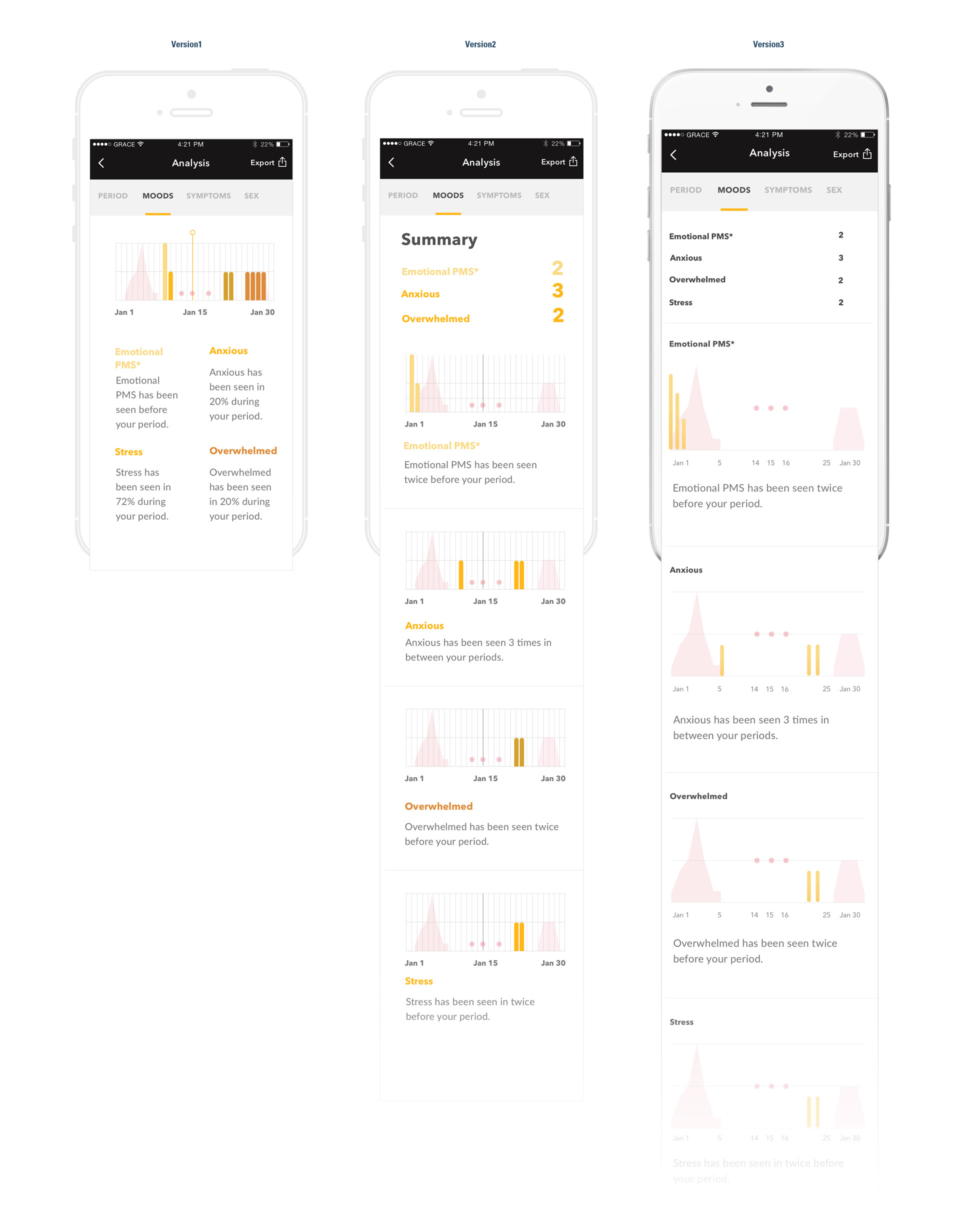
The target audience is mainly young women between 13 and 35 years old who are looking for a comprehensive and easy-to-access way to manage and understand their periods. For a richer experience, notifications resonate with a user’s needs or conditions; for instance, users receive tips for stress relief if they often track high emotions. The supporting content will be provided by professional obstetricians.

Subject Research & Analysis

To accomplish Period Pal’s unique value, I’ve done a intense research and consulted professional OB/GYN doctors. The important part is to make sure the right notification get sent out at the right time without interrupting users or overreacting. In this diagram, I’ve illustrated how the diagnostic process goes in Period Pal. For instance, irregular periods are very common for young girls when they’re just starting to menstruate, or some users simply forget to keep track their periods. We want to exclude those factors before sending out notifications.

Persona

Every girl is unique and as are the problems they face. Even Period Pal won’t be able to cover all the possible scenarios, but I still want to figure out what are the most frequent problems that may happen in 80% of female and find the a way to verify my solution and content fit their needs. After user interviews, I came up five personas. Instead of focus on product features, I tried to dive deeper into the consumer’s mindset and to figure out their most common needs and desires. When and why would they decide to see an OB/GYN? Have they ever associated their period with daily activities? How do they currently keep track?

Competitor Research

Period Pal has three biggest advantages:

  • Dynamic communicate strategy: Period Pal is not just tracking, it ‘talks” to users with resonated notification, alerts and intense content.
  • Scientific validated from professionals: we have a group of OB/GYN doctors working with us, define the  criteria and diagnosis flow.
  • Brand & design: This app provides clear, meaningful and modern tracking traits and all the advertorial content has been sharply edit and create.

Ideation

Any habit-tracking app will request a user’s investment and involvement, so the challenge is to engage with users. Luckily, there are some internal triggers (“Today is my first day of period this month — I need to log that,” or “Today should be the first day of my period...but why hasn’t it come yet?”) Those are great natural triggers, but external triggers like notification and reminder, reward systems and better tracking in general, users will be more involved in the logging process.

Sitemap

The hardest part of the tracking process is if the user falls into a unique category. Some users have more traits to track; others may have very a few. I tried to find a solution catering to different levels of users. What could PeriodPal cater different needs? I then keep exploring in the wireframes.

Sitemap Version1

Sitemap Version2

Wireframe

For those users who wants to track only basic info, a quick access is the most helpful way to lead users to exact simple task, but on the other hand, for a daily tracker, the routine should also be easy enough.I’ve compared a couple of solutions for the main tracking flow.

I tried to be rational through analysis of options. 

UI & Branding Design

The image of Period Pal should be friendly, accessible, and professional. It seems any app under this topic tends to be pinkish. Personally, I agree that warmer colors are better than cooler ones. I also tried to find the balance between seeming too serious (sleek) and too childish or playful.

User Testing

I developed three versions of the UX structures, and I wanted to compare the first and the final lo-wi wireframes. The previous version landed on a calendar and tracking page directly. The main page has three functions: notification of next period, ability to track daily specifics, and ability to add/edit periods on the calendar. However, testers usually only understand one or two of these functions. Even though they may be able to guess their functions, they didn’t know how to or hesitated to click on the most dominant element on this screen — the material design principle seems to fail in this case.

Design Iterations

As usual, I dove deeper into the logistics and user cases. My testing and research showed that most people only use the app to check when they should expect their next periods and only tracked the start date, end date, and any severe symptoms.* But around ⅔ of them expressed interest in developing a more detailed diary to track everything they’d like to make note of. Potential users are more likely to open the app for quick check — they’re more likely to look for their next period date but less likely to create a period when they’re in a rush. (To create a period, you needed a clear memory for the start and end dates and at least three clicks to finish.) After carefully analysis, I think it’s important to create a home page with the capability to track the most important start and end dates and keep more details related to tracking in other tabs. By removing the calendar, I also have more room to display the related content and, potentially, even ads.

*The results come from the eight users I interviewed and a lot of online commentary on existing apps.

I also bring alerts into a tab rather than a sub-tab below the setting to create an analytics home screen before getting into the details.

What I've Learned

This is the first time I’ve run a comprehensive nighttime (after work) project like Period Pal. Not only did I work as a designer but also as product manager and marketing strategist. It is both challenging and rewarding, especially working in a team with professional gynecologist Dr. Maria, thoughtful developer Joe, and talented content director Heather. As a product manager I also need to analyze the value proposition investment of time. 

Besides, as a UX designer, I need to make sure the right amount of content is provided at the right time to users in need. For example, users only saw most popular medication under medication tracking, but they can click on “load more” and access to other medications or create their own medicine.

Drop Me a Line

Your Name
What's up?

Email Sent!

Thank you.
Soon we'll be in touch.

Oops...
A problem occurred while sending your message.

Passcode Required