Grace Experience Product & Marketing UX Design

Well done is better than well said.

Responsive Web Design

Ideation Website

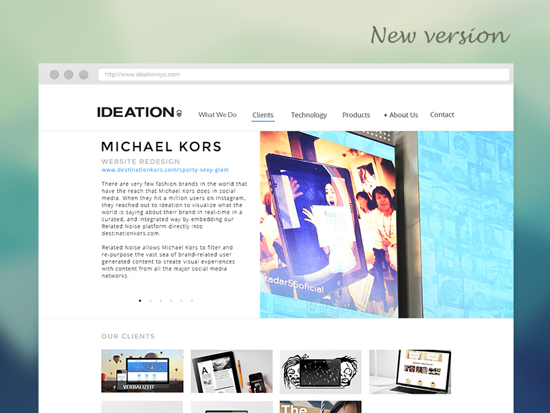
Ideation, as a creative production company, wanted a homepage that would stand out. My mission was to develop its information architecture, usability, and interactions for an engaging experience.

Project Brief

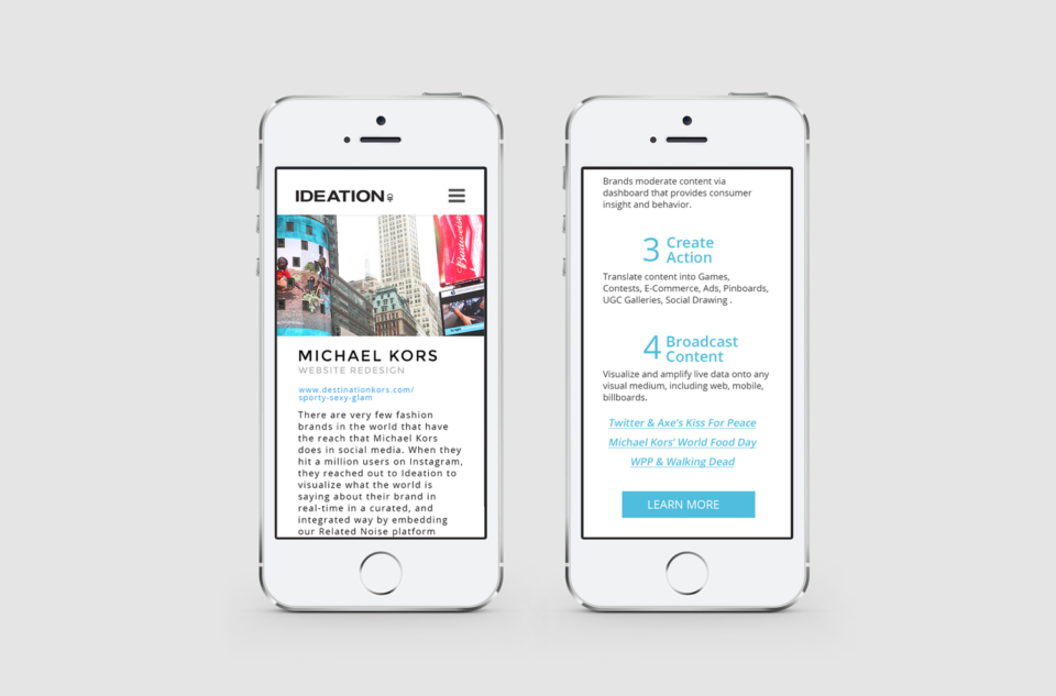
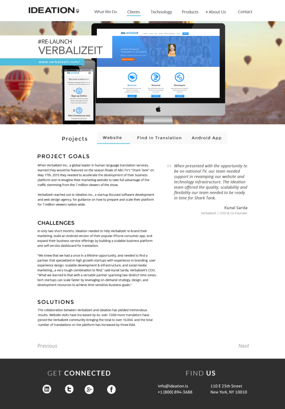
The website was designed to fit various screen dimensions. Every detail of design had been reviewed prior to development to ensure a solid foundation for any following logistics. I also created director's cut version after the site launched.
Subject Research & Analysis

Ideation, as a creative production company, requested an extraordinary-looking homepage. My initial approach was to research the differences between Ideation and its competitors. It’s not just about who designs or codes better; it’s the unique goal and spirit that has to be turned into an expressive visual form and easily distinguishable by visitors.

Prior to this version, projects had been displayed in boxes listed under the designated tab. They didn’t have a great click-through rate. Ideation usually works with a single client on multiple projects, but there wasn’t a filter for client or type. To better resonate with a prospective client, projects should be listed in a searchable way. Last but not least, Ideation had been working with big-name fashion brand (like Michael Kors on a Times Square billboard), which should be featured on the landing page.

Ideation

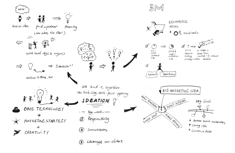
To make the website more engaging and have a tech-first feeling, I emphasized Ideation’s uniqueness. Developers with different skills collaborated on the project, and it started with cutting-edge concepts. I created a couple of directions from sketch.

Sitemap

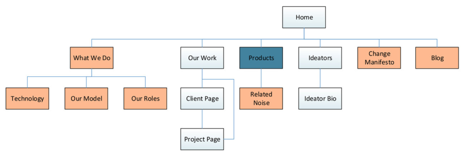
Here’s a simple site map that captures the key pages. The important pages not only sit higher in the hierarchy but are also linked to from multiple pages.

Wireframe

Wireframes for the Ideation website focused on how each page connects by considering potential clients’ journeys. Although I’ll dig into the design details later, it’s always good to plan out the high-level information first. It allowed me to define the information hierarchy of my design, making it easier to plan the layout according to how the brand wanted its user to process the information. At a deeper level, a wireframe is also very useful in determining how the user interacts with the interface. For example, wireframes can contain various states of button or menu behaviors.

Director's Cut

The website design shows how we leverage our client's brands with Ideation's technology. With the iconic style presentation, Ideation articulate our ability to effectively achieve goals alongside with our client. The proven success of clients is also a nice to have on our site.

What I've Learned

Since this project, I started analysis on website performance, review and analysis the result of each launched version. There are always new findings when you take a look at Google Analytics. For example, a surprisingly 19% of users came to the Ideation website through mobile devices. Outside of the desktop version, we put a lot of work into a responsive design, even with the most complicated animations. I saw how the bounce rate related to drop-off rate, and quickly came up with 23 versions of one page to figure out the best fix. Working closely with developers and being able to help with testing and QA gave me a full stack experience on website production.

Drop Me a Line

Your Name
What's up?

Email Sent!

Thank you.
Soon we'll be in touch.

Oops...
A problem occurred while sending your message.

Passcode Required